Engineering Consistency: Refactoring the Wait State
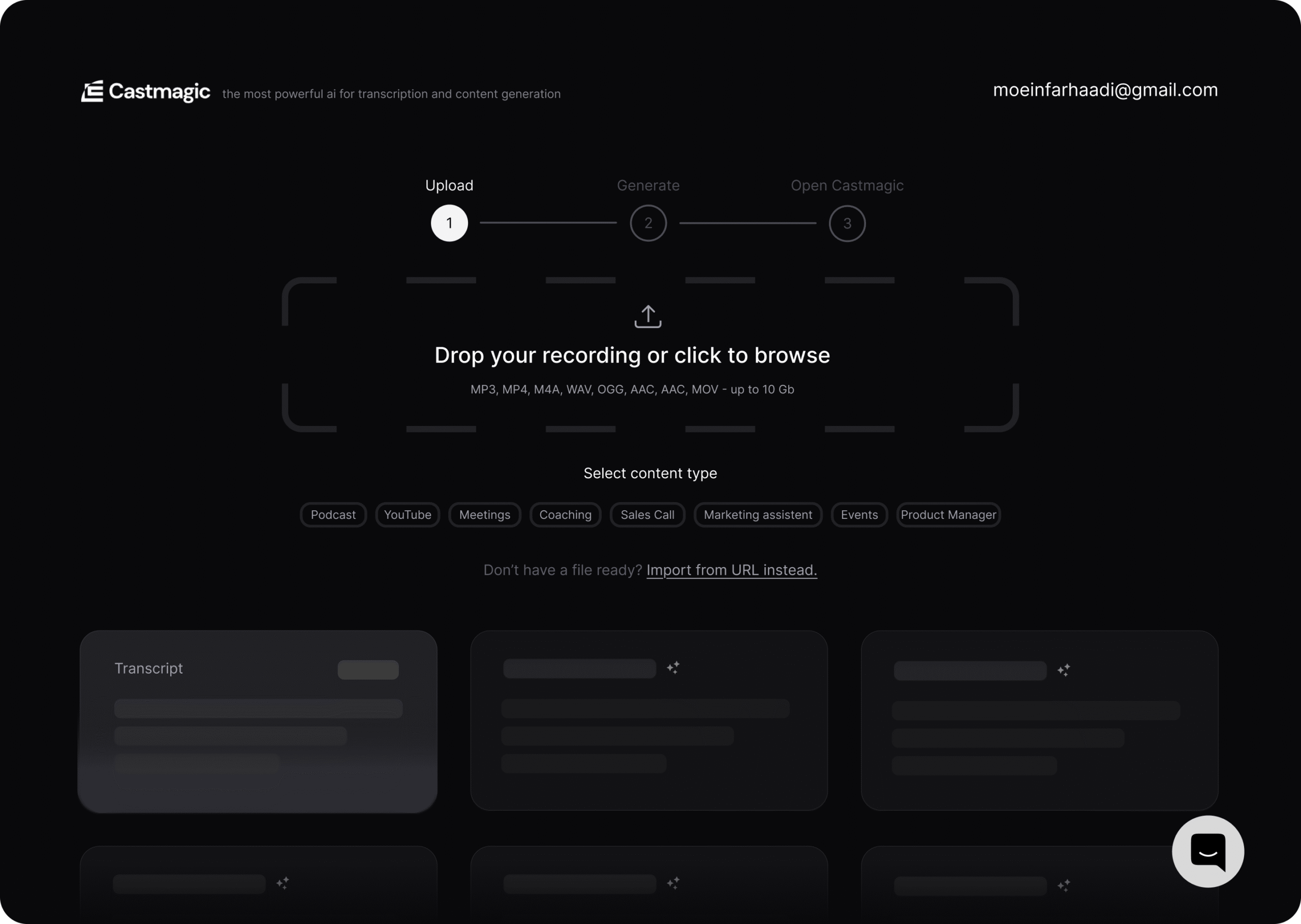
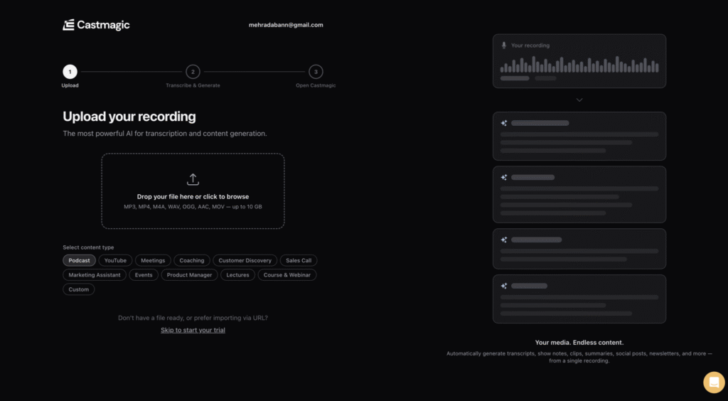
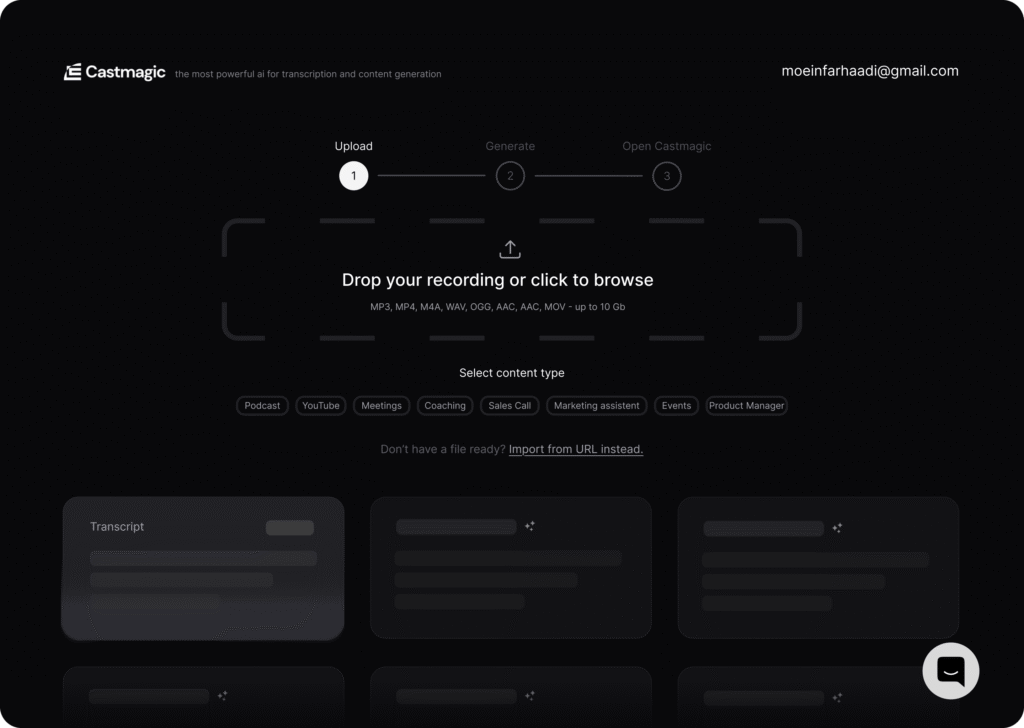
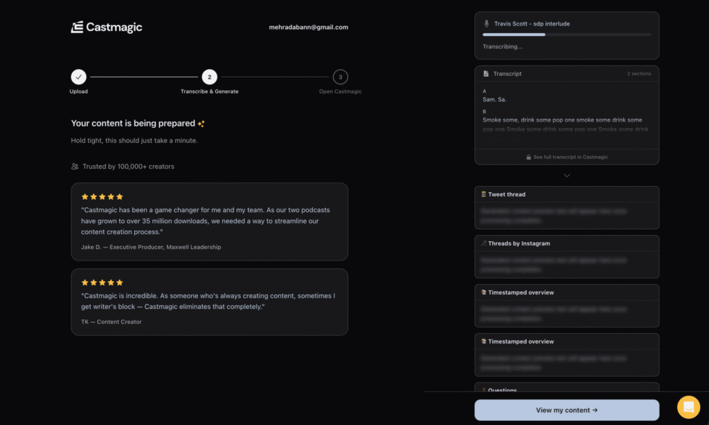
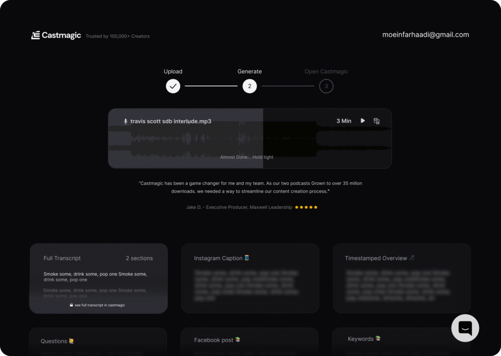
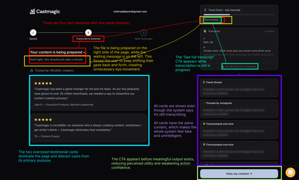
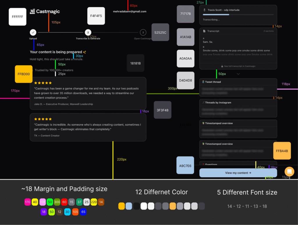
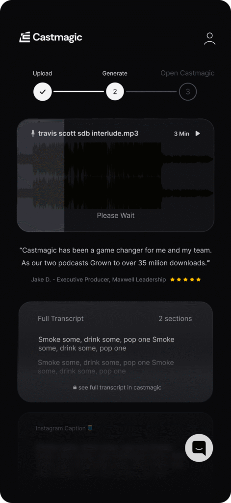
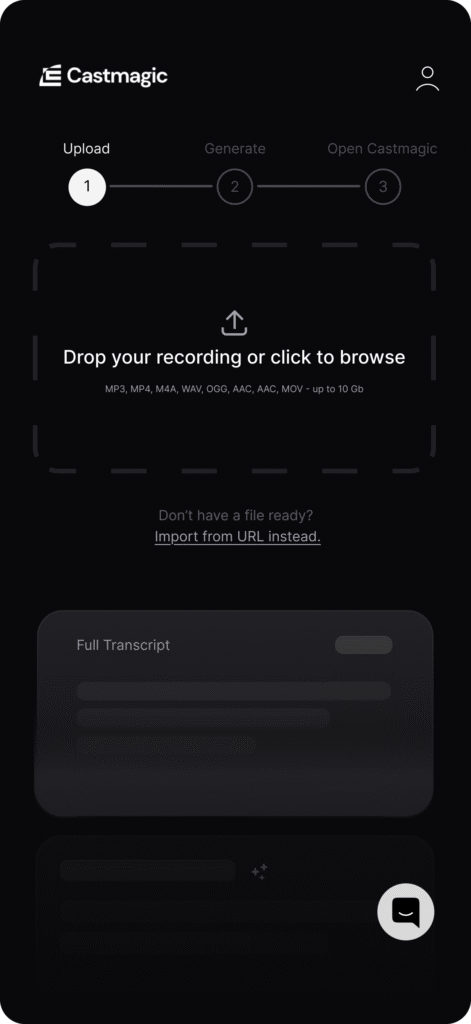
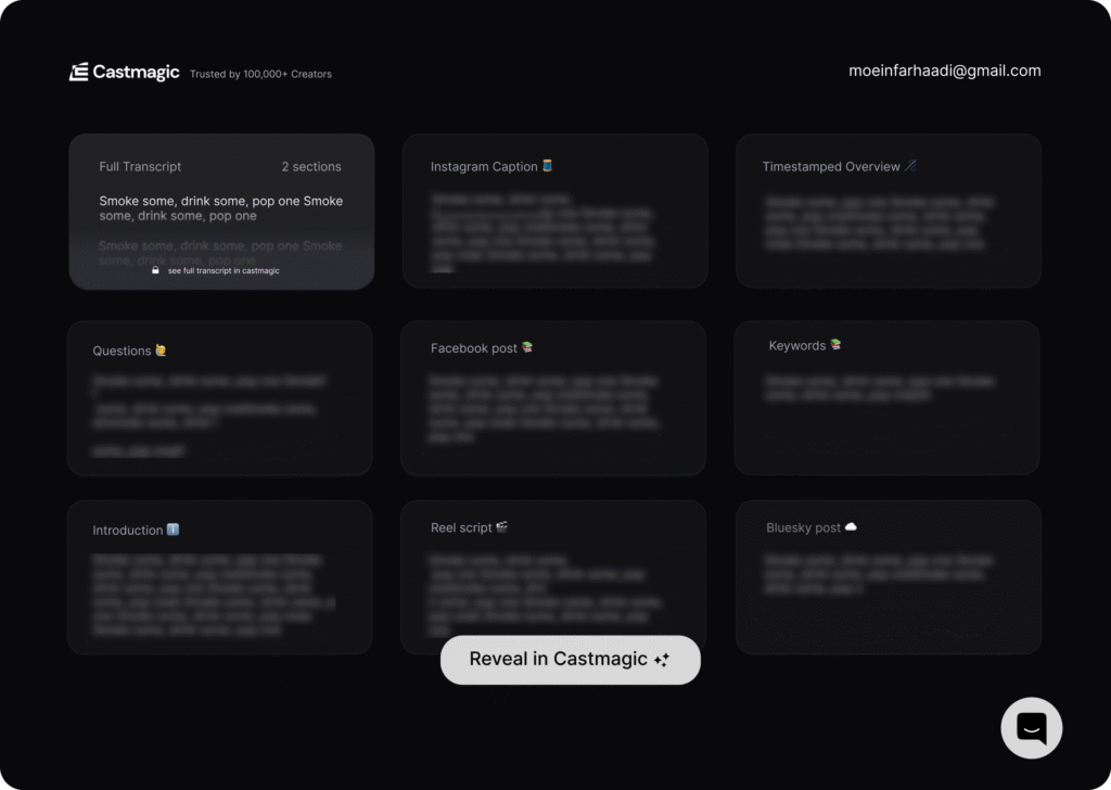
The original wait-state experience had accumulated significant design debt: inconsistent spacing, fragmented typography, and ad-hoc color usage created visual noise that weakened trust in the product.
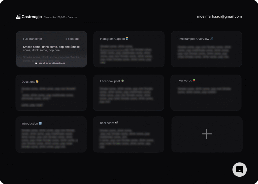
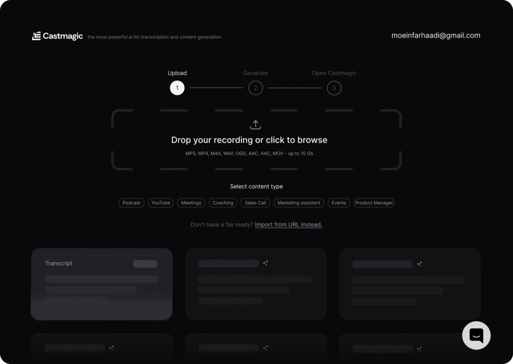
To create a scalable foundation, I refactored the interface into a systematic design architecture aligned with established industry standards.
The Systematic Overhaul
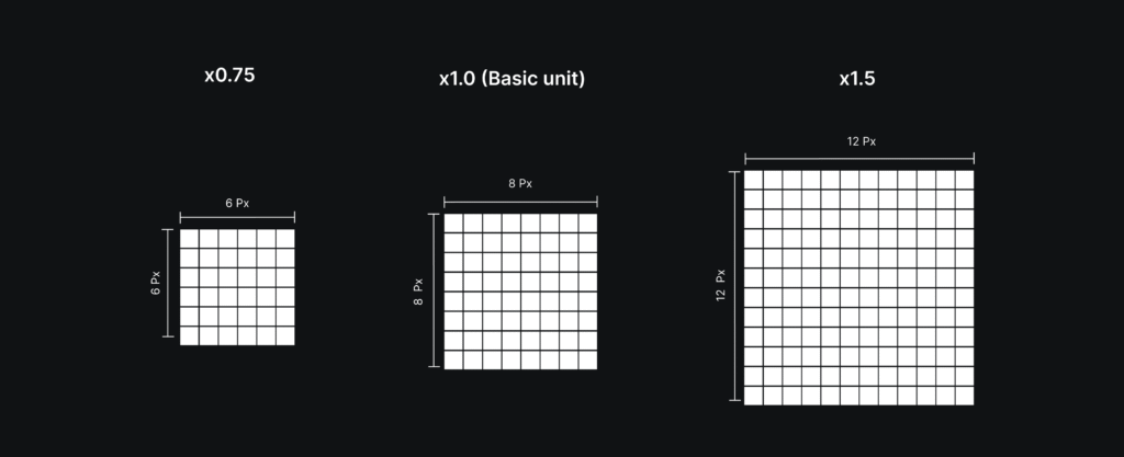
8pt Grid System
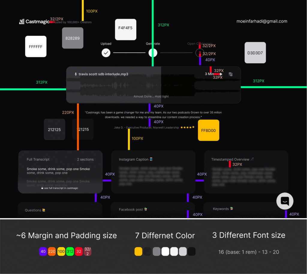
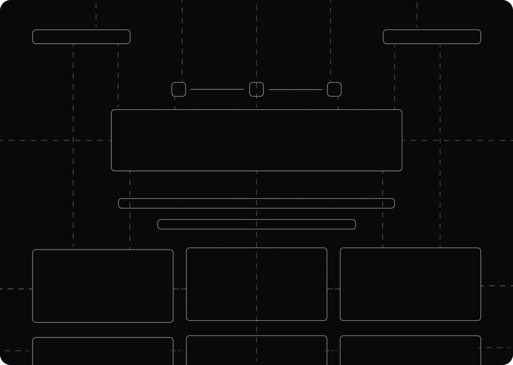
I replaced 18+ inconsistent spacing values with a strict 8pt grid system, following conventions used in systems like Material Design and Apple’s Human Interface Guidelines.
This introduced:
consistent visual rhythm -
predictable responsiveness -
cleaner alignment across screen sizes -
reduced layout drift
The result was a more cohesive interface with significantly lower visual noise.
Modular Typography
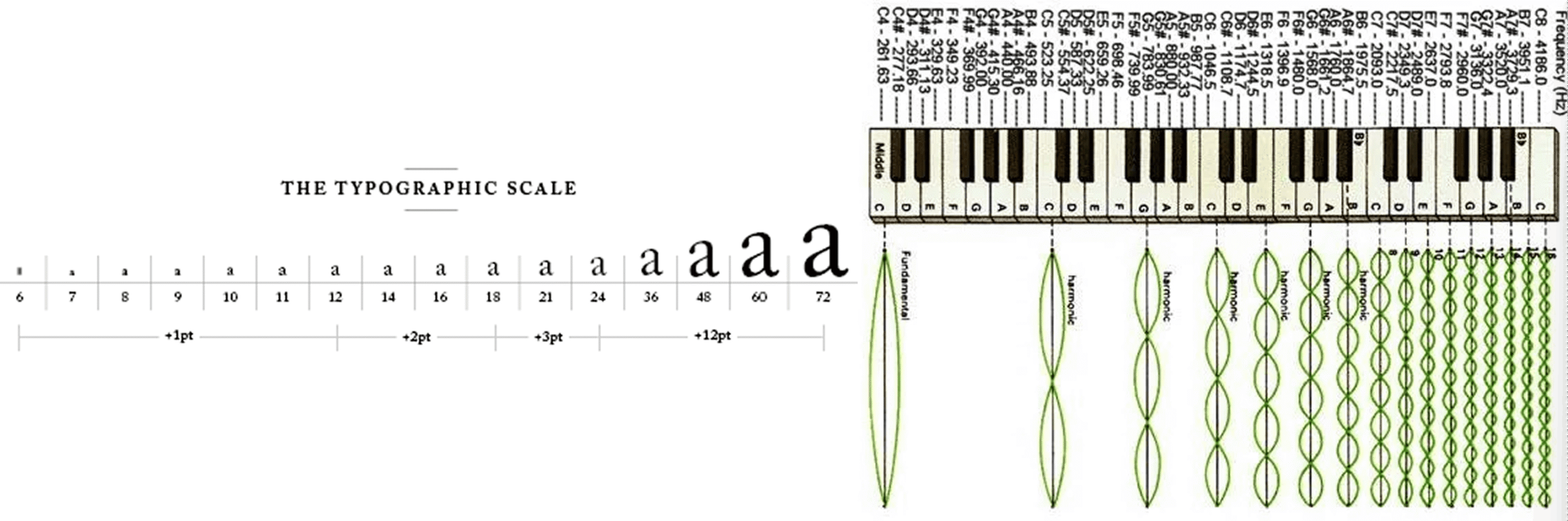
The previous UI relied on fragmented font sizing with weak hierarchy.
I introduced a modular type scale using:
16px / 1rem base sizing -
1.25 scale ratio -
standardized heading and body relationships
readability -
scanning behavior -
accessibility consistency -
cognitive clarity during AI processing states
Semantic Color Tokens
The legacy interface used 12+ hardcoded color values with no semantic structure.
I consolidated the system into 7 semantic design tokens, separating visual intent from implementation.
This enabled:
scalable theming -
easier dark/light mode support -
faster engineering implementation -
reduced styling inconsistencies across components
The Business Impact
Reinforcing Trust in AI
AI products inherently introduce uncertainty for users. The original cluttered interface amplified that uncertainty by feeling visually inconsistent and operationally unreliable.
By simplifying the interface and establishing stronger visual hierarchy, the experience became calmer, clearer, and more trustworthy — reinforcing the perception of precision during processing states.
Scalability & Developer Velocity
Moving from ad-hoc styling to a tokenized system reduced front-end inconsistency and eliminated recurring implementation guesswork.
The refactor created:
a scalable design foundation -
faster feature iteration -
lower UI maintenance overhead -
improved consistency between design and engineering
Conclusion
The legacy wait state lacked a cohesive system for spacing, typography, and color, resulting in a fragmented experience that weakened both usability and product perception.
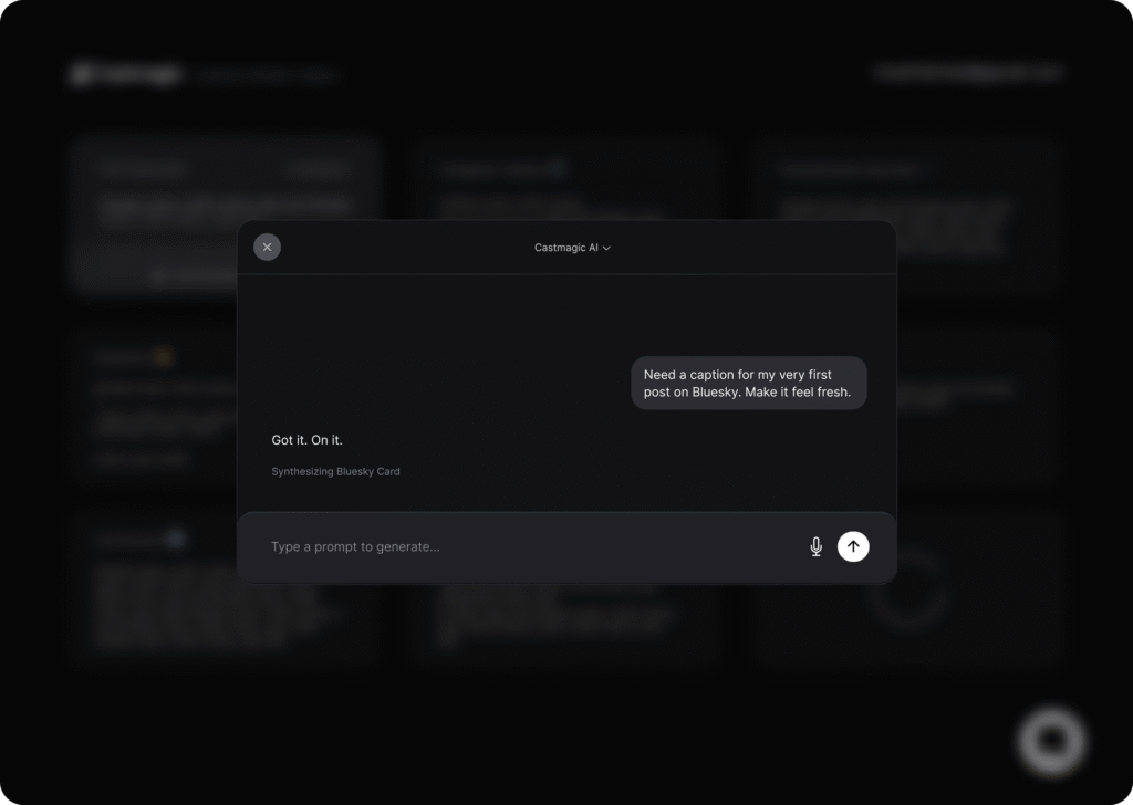
This refactor transformed the interface from a collection of isolated decisions into a scalable, tokenized system designed for long-term growth.
Beyond improving visual quality, the redesign strengthened user trust in the AI experience while reducing technical and operational design debt.